Web Design
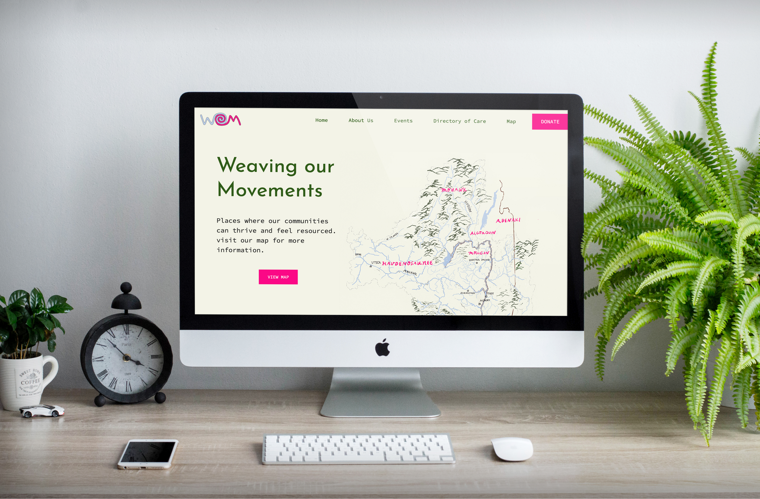
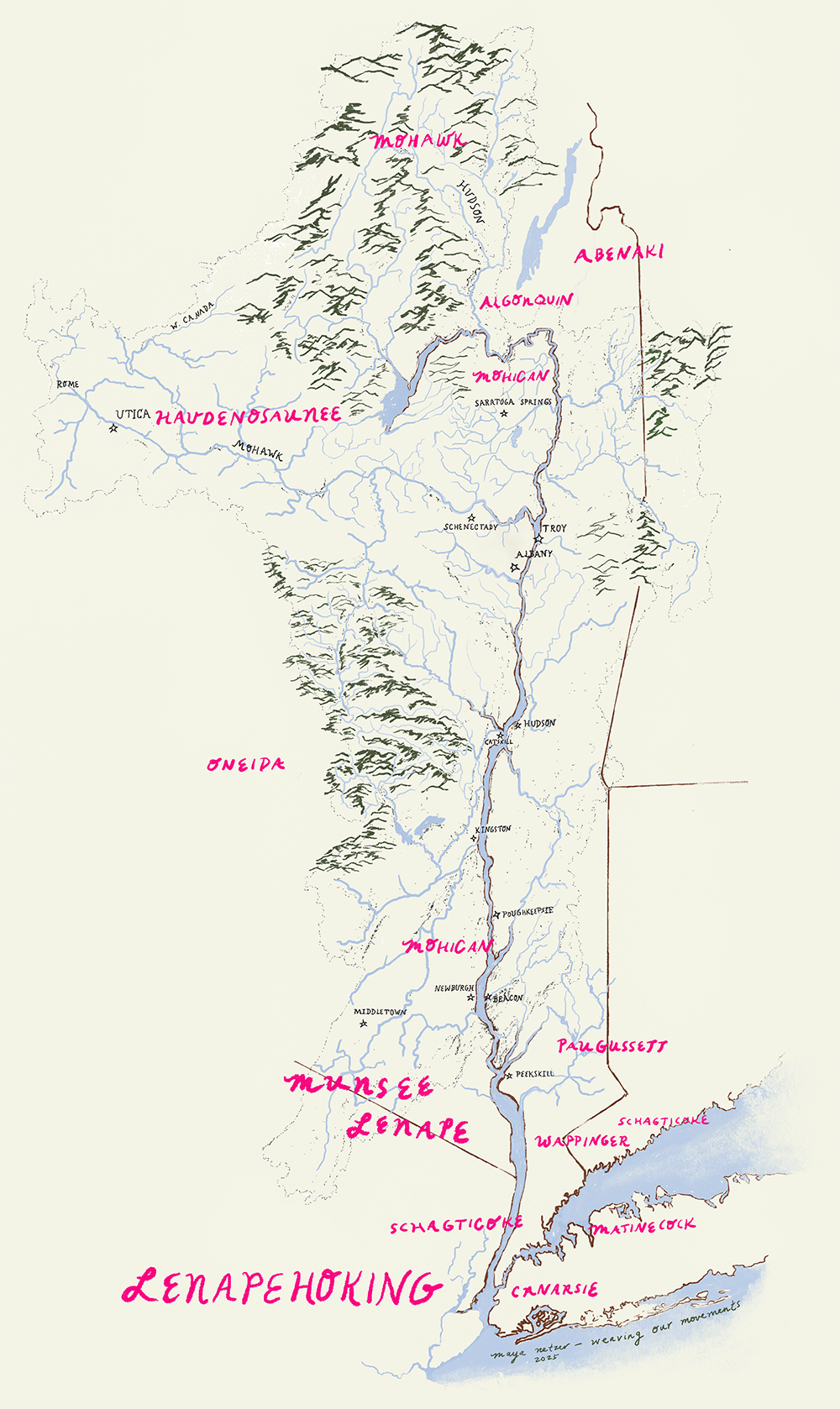
Weaving our Movements
Intention
Create an information hub to increase access and amplify grassroots initiatives while relying on community-based efforts.
Impact
An online database that can grow alongside the community—allowing them to plan, support, and engage with one another at their own pace
Lesson Learned
“We know more than we know. We don’t know all, but together we know a lot.” - HypoFutures Guideline #2
About Weaving Our Movements
“Weaving Our Movements was dreamed up by a collective of community-based cultural architects, healers, organizers, solidarity economists, futurists, farmers, artists, and caregivers as a need for consolidating the sharing of local information, resources, collaborations and support.
Inspired by our waterways and how they connect us through time and space, the intention for this website is to be an information hub to increase access and amplify grassroots initiatives while relying on community-based efforts.
In an effort to collectively align with the flow of material and immaterial support, we created this database to connect one another in reciprocal exchange: a place to find each other, share our gifts, redistribute our abundance and strengthen our communities locally and beyond.”
Brief
Create a website that allows Hudson Valley practitioners to learn about one another, connect, and collaborate.
Strategy and Analysis
Weaving our Movements needed a platform that was usable, customizable, and accessible. Although it was still in its infancy, they needed the site to:
Be able to scale dependent on the needs of its community
Accommodate members that might not use the internet regularly
We decided to focus in on simple, yet highly functional features to really amplify connectivity. For example:
Instead of creating custom forms on-site, we defaulted to google forms because of user familiarity and ease of use
For events, we opted for a calendar view that mimics physical calendars as opposed to a grid of individual events filtered by date or type
Site Map
Design Strategy
Community, Community, Community.
The client knew from the beginning that they wanted to be able to showcase different artists in the community through logo design and artwork on the site. This created an interesting branding challenge because we needed to be able to create a tone for the site that inherently made space for different voices, styles, and aesthetic—good thing branding isn’t just about a logo.
We instead took to the elements we knew we could keep consistent, which were site components, font, and base colors. We didn’t want to restrict any future designers or artists, but we also didn’t want to overwhelm the audience with a whole new site every single time a change was made.
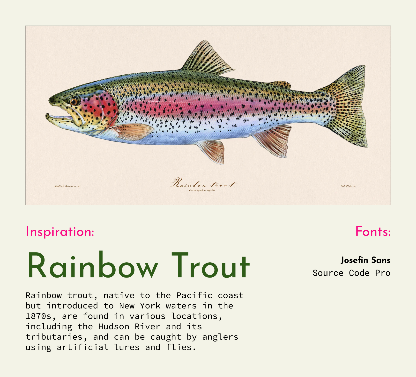
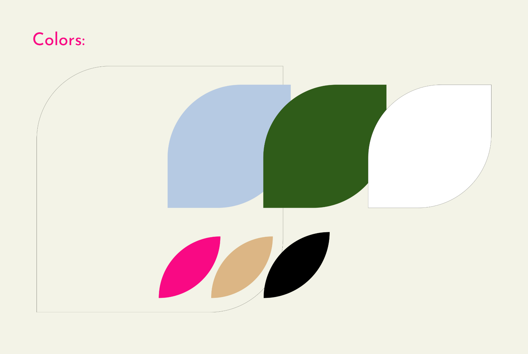
Color: Inspired by the river, nature, and queerness, we created a color story based off of the Rainbow Trout—a west coast settler of the Hudson River tributaries.
Font: We paid close attention to fonts that felt traditional, but could be paired together to create something new and unexpected.
Components: We saw an opportunity to bring more organic shapes into the digital realm. Circular shapes that also meet 90 degree angles were the perfect blend of organic communities meeting on the internet.
Seasonal Art: these elements include the Weaving our Movements logo and map. We wanted each artist to be able to be inspired by the branding of weaving our movements while still feeling open to express themselves.
Through combining these bright colors with smooth, organic shapes, and typography, we were able to create a quirky, friendly on-site tone that could speak to its growing community

Web Design